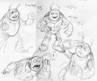
This is what came out of looking at some june bug photos. Before I was having a hard time with this character (the humanoid ones, in fact) because I was drawing them too closely to traditional comic book human proportions. I think I was trying to make a beetle guy that was about 6 heads tall and it looked weird! I shrunk the proportions some, so that now he's about 3.5 heads tall.
If you're unfamiliar with head height measuring, look at a character or draw one. You can measure their proportion's roughly by dividing their height by the height of their head (it's not an exact science, so just use your thumb or a pencil as a measurement reference if you want). I think in the 90s most superhero comics had an average heroic proportion of 6 to 7 heads tall. Another comic art book I saw sort of recently (I'm blanking on the title) I think called 7 heads the minimum height for a superhero, with some examples up to 8 or 9. Anyways, proportions like that work great for human characters, but it makes sense to have bugs with smaller proportions well... because they are small! Feel free to correct me on any of this.
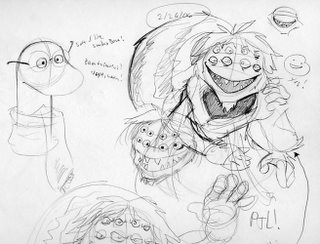
Anyways, the beetle is moving along well and so are the spider and worm...

She just looks like she's up to mischief! One thing I use as a gauge to decide whether or not a character is coming along well is how easily I can get them moving or active. These characters are challenging, since most of them have at least 6 limbs (the spider 8) and I don't want to cheap out. If anything it seems like the extra limbs are going to lend themselves really well to body language (like the beetle sketch in the first image where he can shout with two hands and point with his other pair. That's just darn cool!) I'm hoping to get some good gestures out of them and the more used to a character I am typically the easier it gets.

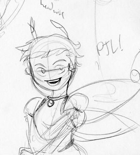
What adventure story would be complete without a rockin lady worth rescuing? I still need to do some thinking on this one, but I'm feeling good so far. She started more or less looking human, and then like a human with anteannae. Not cool! Since the beetle doesn't have a nose I tried the girl without one too and made her head rounder. That brings us to here, the start of a cute bug girl.
I've been trying to steer clear of the bug suit thing I mentioned before and I don't want to pioneer the dark and lonely path of bug furries either (I know I wouldn't be the first! yikes...) Are things anthropomorphic enough without being creepy?
Ok, time to read! I'm almost done with The Colour Out of Space and I just had some tea. I'll probably pass out shortly regardless. Until then, party on!


1 comment:
the queen looks kinda puppety right now, but you're going in a good direction. maybe try something with making the head look like a hairstyle...beehive? and doing something unconventional and less human with the eyes. check out my refs!
eye design
some sample lightning sketches...while at work...
helpful...or obnoxious?
Post a Comment